Tips for Designing Window Graphics
MAY 29, 2020| SpeedProWindow graphics are a popular design medium for many reasons. They are versatile and bold, grabbing the attention of people walking by and drawing them toward your storefront. They can also create environmental effects and promote your brand. Temporary and permanent retail window graphics make them adaptable for many uses and environments.
With so many options, designing the right window graphic might seem daunting. You’ve got to think about design principles, marketing goals and legibility, not to mention the quality of the graphic itself. Window graphics are an excellent choice to support a storefront, but your design can take them to the next level.
1. Know Your Options
Window graphics will take on a wide variety of designs, but they are also versatile in terms of the products themselves.
Here are a few of the window graphic options that we offer:
- Window clings: These thin graphics don’t have any adhesive to help them stick to the surface of the window, using suction instead to stay in place. The biggest benefit of marketing window clings is that they are moveable and adjustable. They’re great for businesses that reorganize a lot or are rapidly expanding and may need to change locations.
- Opaque and clear decals: Decals are meant for more permanent placement than clings. They have an adhesive on one side and tend to be thicker. While they are more permanent, they cannot be repositioned after placement. You can find store window decals made of low- and high-tac that support varying degrees of environmental stress. You can put text on a clear decal for easy lettering or fill in the background with colors, a design or an image for full signage.
- Perforated decals: A perforated decal acts like a see-through surface, so you can look through the windows from inside your building while still advertising your big sale on the outside. These are also common in vehicle advertising to ensure visibility while driving. For buildings, they allow the room to still feel open and provide a view of the outside world while making use of the valuable window real estate.
- Frosted decals: One last approach to decals is one that helps to achieve the look of frosted glass. These decals simulate the appearance of etched glass and are excellent for creating subtle privacy additions and decor. Try adding stripes of a frosted decal or blocking out a window in a door with it to create an elegant and functional piece of design.
Whether you’re using your graphics primarily as advertising space, a piece of decor or some other purpose, the array of styles available make window graphics an excellent medium. Of course, you’ll need some powerful designs to make your storefront window graphics really pop. Once you know what kind of window graphics you want for your business, you can start designing.
2. Identify Your Sizing Upfront
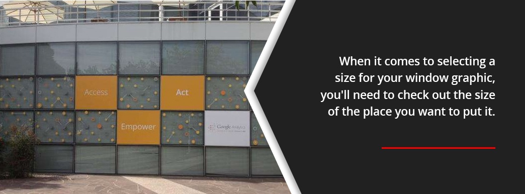
When it comes to selecting a size for your window graphic, you’ll need to check out the size of the place you want to put it. Are you using a decal as a way to display your store hours on a door? Make sure it fits alongside your logo and any other signs you have up. Are you looking for a full window decal that fills the frame? Ensure that it reaches to the edges and fits the size exactly for a clean, professional look.
Since we can make them in large sizes, window graphics are great for getting creative and going big, too.
Here are a few ideas for large-scale designs with window graphics:
- Decor and ambiance: If your building offers a lot of glass real estate, you can use decals and window clings to create a unique feeling when a client enters. You can put full window graphics of a pattern across tall glass office walls or cover an outdoor-facing window in beautiful imagery.
- Multi-panel images: If your business has lots of repeating window panels, you can use that to your advantage. Consider storefront window decals that span the entire building, or create a checkerboard pattern with your business colors on alternating panels. You can lean into the architecture of your building to get a unique design and catch the eyes of people walking by.
- Privacy covers: Frosted-glass and opaque decals can help you create some privacy within your building. Whether you want to cover the windows up all the way, provide partial coverage looking out to the street or frost the glass between offices, large window decals can help.
- Large-scale advertising: There’s nothing fancy with this technique — if your storefront has large, tall windows in its entryway, fill them with full window decals advertising a sale or event. The vast size is an excellent attention-getter, especially if paired with bold colors and fonts.
3. Pick Your Colors Carefully
Decals look good in most any color. If your business window graphics are going to be clear, you have to pay a little more attention to your contrast if you want it to be readable.
Imagine walking past a storefront on a sunny day where the dark windows fall into shadow, and you have to put your face up to the glass to see through it. It’d be pretty hard to read black text on that dark surface, right? That’s because the black text has low contrast with the dark glass. Using white or yellow text creates high contrast and improves legibility. For logos or text-only designs where the background is not filled in, you need to consider the environment. Darker texts can work indoors if the room is well-lit.
If you’ve decided to fill the background of your decal, you have all the choices in the world. Of course, you’ll still want to follow general design principles, which is a statement that’s easier said than done. But we’ll get into those later. For now, let’s focus on the color wheel.
The Color Wheel
Color theory is a complex science, and while we can’t cover it all, we’ll go over the basics.
When you decide on a color scheme, you’re often looking at using analogous colors or complementary colors. These terms refer to the locations of colors on the color wheel and their relationship to each other. Analogous colors are right next to each other, like red, orange and yellow, while complementary colors are opposites, like blue and orange. Additionally, you’ll want to know the difference between primary, secondary and tertiary colors. Primary colors are red, blue and yellow, and secondary colors are mixtures of them. Tertiary colors are combinations of secondary colors.
Analogous colors are great for overall design schemes, but not so good for contrast. Try reading yellow text on an orange background. For contrast, we turn to complementary colors or look at using white and black, one of which is usually always easy to see on a color. This need for contrast is often the reason for accent colors, which pop out from the overall color scheme and grab our attention.
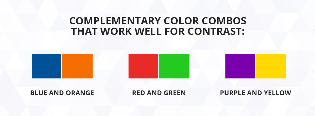
Below are some complementary color combos that work well for contrast:
- Blue and orange
- Red and green
- Purple and yellow
Contrast is necessary for a design to pop and for text to be legible. When we’re looking at business window graphics and marketing designs, making it attractive and functional are both critical to getting your message across.
When it comes to selecting the colors for your design, consider the associations that we have with certain hues, a topic that Smashing Magazine covers in great detail. Blue is a peaceful color that can feel reliable and sophisticated, though it’s quite versatile with its many hues. Red can sometimes feel aggressive, but it’s also vibrant and spontaneous, which is why you see it in fast-food restaurants. We often find white to be sleek, minimalist and elegant. Keep in mind that some cultures have different associations with these colors, so you’ll have to do your research for different markets.
You may already have company colors picked out for you, which makes this job a little easier. If you have the license to do so, consider using different shades and tints — i.e., adding white or black to the color — for some variation.
4. Prioritize Readability
The most significant consideration when it comes to text is making sure it is legible. If your viewers can’t read your sign, they’re not going to take the marketing message with them.
Think about how far away your readers are going to be from the sign. Is it going high up above the street where they’ll be far away, or will they be walking right past it on the sidewalk? Will your retail window graphics always be in good lighting, such as indoor placement, or will they be subject to the whims of the weather as people try to read them through foggy mornings and bright glare from the sun?
The further away your readers will be, the larger your text needs to be. Check out The Print Handbook’s chart on viewing distances for minimum suggested text sizes.
Here are some common distances for reading storefront window films and decals:
- Two feet: 5pt text
- Five feet: 13pt text
- Ten feet: 25pt text
- Thirty-three feet: 82pt text
- Fifty feet: 125pt text
Size can also play a role in the contrast of your text. Contrast is going to rear its head again when we look at text. Lettering needs to stand out from its background. Avoid colors that are too close together on the color wheel or are garish when paired together, like lime green and hot pink.
Try dark colors on a light background, like dark blue or green on white, or light colors on dark, such as yellow or white on black or dark blue. There are several online tools you can use to measure the contrast of your text, many of which use standards set forth by Web Content Accessibility Guidelines (WCAG). Though these guidelines are for digital graphics, the suggestions for contrast requirements can be applied to print colors, too.
5. Pick Your Images Carefully
You can use a wide variety of images in your commercial window decals, but try not to choose anything too busy or distracting. It should support your message without detracting from it.
Be careful not to put your text in a bad spot, like a space where you’ll create low contrast. If you’re using text, it’s best to choose an image where there is room in the composition for a new element, such as a photo with a sprawling blue sky or an awkward space you want to fill.
The image itself must be high-quality. Talk to your printer about the minimum resolution you can use for your window graphics’ size. Usually, this is measured in dots per inch (DPI).
6. Follow Basic Design Principles
If you’re not a graphic designer, it might seem like there’s a lot to keep track of. When creating your graphics, keep the following design principles in mind for an aesthetically pleasing image:
- Alignment: Elements need to be in alignment with each other. That’s not to say you should follow a grid for your entire design, but basic pieces, like lines of texts, should be the same width away from the edge and line up with each other.
- Hierarchy: With different elements of varying importance, you’ll have to find ways to give weight to the most important features. Offset important text with larger fonts or put the most important information higher up on the sign. Separate your secondary information appropriately.
- Contrast: Our good friend contrast is back. Use it wisely to add emphasis where you want it.
- Repetition: Repetition may not be overly valuable in making a single decal, but you might want to consider its value if your design works with other signs or a theme. Use your company’s signature font or colors to reinforce marketing efforts.
- Proximity: Think about how close together your elements are. Are they crowded and busy, or do they draw the eye around the piece? Clusters of information can help you open up the overall image, or you can join them together with elements like color or font to group similar aspects.
- Balance: Balance doesn’t mean symmetry. It can, but asymmetric designs become balanced in other ways. They might use contrast to balance out the image or negative space.
- Color: We’ve already talked about color, so we won’t go over it again. Just keep the mood in mind as you select colors.
- Space: Many designs use negative space to their advantage, developing form and bringing the focus where they want it. Don’t underestimate the power of negative space.
Contact SpeedPro for Custom Commercial Window Graphics
Whether you have your design figured out or need a little direction, the experts at SpeedPro are ready to help. We know design, and we know printing. We can offer design assistance and bring your marketing goals to life with durable and high-quality products for outdoor and indoor use.
Window clings for businesses, commercial window decals and other custom window graphics are all in our wheelhouse. Learn more about our window graphics or contact a studio today for a consultation or quote.


![Basic Design Principles [list]](https://www.speedpro.com/wp-content/uploads/2020/05/04-Follow-Basic-Design-Principles.jpg)
