10 Directional Signage Design Guidelines
DECEMBER 17, 2019| SpeedProCategories
SignageImagine trying to navigate an unfamiliar parking lot or building that had no signs to help guide you. You’d be completely lost. Directional signs serve a critical function in our everyday lives and help you as a business create a welcoming and convenient environment for your employees, customers and guests. While directional signage in general is essential, not all directional signs are created equal. Some of these signs are far better designed than others.
If you’re looking to install custom directional signs at your new facility or upgrade your existing system of directional signage, check out these 10 tips for how you can design directional signs that make your facility a more hospitable environment.
What Is the Purpose of Directional Signage?
Directional signs, also called wayfinding signs serve three main purposes. They:
- Point people in the direction they need to go to find a certain place.
- Identify a room, wing or other area by labeling it.
- Inform people of the regulations and instructions they must follow in a space.
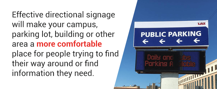
Effective directional signage will make your campus, parking lot, building, park or other area a more comfortable and accessible place for people trying to find their way around or find information they need. When these signs are designed strategically, they can also help reinforce your branding and enhance your facility’s aesthetic.
Best Practices for Designing Effective Directional Signage
We know directional signs are important, and we’re used to seeing them everywhere we go. But when it comes time to design directional signs for your own facility, you may feel a bit lost. Let’s talk about some design tips for creating effective directional signs for businesses and public spaces. We’re going to look at 10 guidelines that can help you create directional signs that are both attractive and practical.
1. Keep Text Minimal
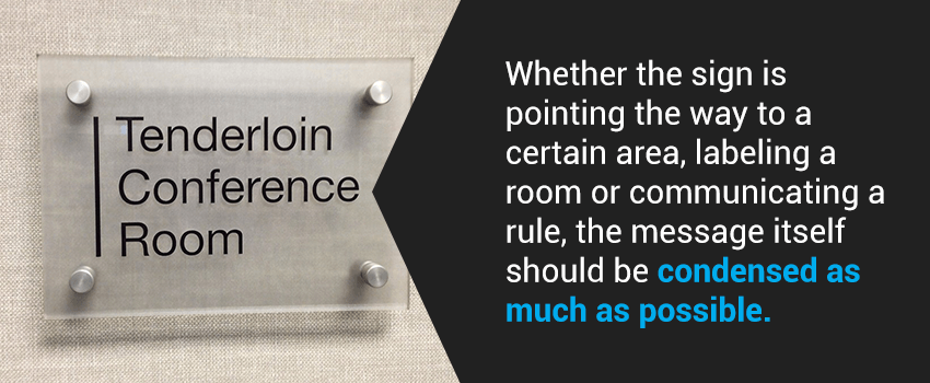
An important guideline that should govern all directional signage design is to keep the text minimal. Whether the sign is pointing the way to a certain amenity or area, labeling a room, providing general information or communicating a rule, the message itself should be condensed as much as possible. There’s no need to overcomplicate your message when a few words will do. In some cases, a single word or even just a symbol will suffice.
Consider the difference in a sign that says, “It is unsafe to enter this room without wearing protective eyewear” and “Protective eyewear required.” If you want to point the way to the stairs, you can use a familiar symbol or simply the word stairs with an arrow pointing the way instead of saying “stairs located at the end of the hall.”
When the text on a wayfinding sign is minimal, people will be able to read the sign easily as they pass by it. If a sign contains too much text, then people will be more likely to tune it out. Directional signs aren’t just for people who are intently looking for help and willing to read a sign no matter how busy it is. They’re also for people who need a simple visual cue to grab their attention to let them know which direction to go or when they’ve arrived at their destination.
2. Opt for Simplistic Design
In keeping with the goal of simplifying text on a directional sign, you should also seek to simplify the overall design of the sign. Directional signs are not the place for highly stylized graphics. You want to design wayfinder signs in such a way that they grab the attention of passersby and make it easy for them to find the information they need quickly.
This means avoiding using too many design elements. A design that’s too busy may include too many colors, too much embellishment around the border, a complicated illustration or an elaborate background that makes text harder to read. All of these factors can ultimately make your directional signs less helpful. It will also make them less visually pleasing to most people.
Instead of a busy design, look for ways to keep it simple. For one, opt for just a couple of high-contrast colors. The text should pop from the background, so choose either a light background with dark text or a dark background with light text. The text should also be in an easily readable typeface so people can quickly absorb the information at a glance. You can incorporate some imagery into the design, which we’ll talk more about later, but it should be subtle and shouldn’t take away from the sign’s primary purpose.
3. Use Familiar Symbols
One way to keep signs simplistic in their text and design is to use symbols to reinforce or even replace the textual message. To replace text, these symbols — or pictograms — should be widely familiar among the people who work in or visit your facility, or else they won’t effectively communicate the message. Let’s look at a few examples of familiar symbols and how they can be used in wayfinding signage to enhance or replace text:
- No smoking: The pictogram for no smoking, which features a cigarette within a circle with a slash across it, has become a sign that people quickly recognize and understand, no text necessary. In some cases, you may want to add text to let people know they may smoke in designated areas or to clarify that the facility is entirely smoke-free.
- No flash photography: A camera with a burst shape to indicate a flash covered in an X or a circle with a slash over it will quickly let people know to turn the flash off of their cameras before taking any photos. This is a handy symbol to use in museums or art galleries where flash photography can damage artifacts and pieces on display.
- Free Wi-Fi: Offering free Wi-Fi is an excellent way to show your patrons hospitality, but you need an informational sign to let them know it’s available. Incorporating the Wi-Fi symbol into your sign will cause it to catch people’s eyes far more quickly than it would if it consisted of text alone. That’s because the wedge-shaped symbol for Wi-Fi has become highly recognizable.
- Stairs: If you’re pointing the way to a stairwell in your building, adding a symbol for stairs or using the symbol alone can be a great way to catch the attention of anyone looking to head in that direction. This symbol can consist only of a zigzag stair shape or can include a stick-figure person on the stairs.
4. Factor In ADA Guidelines
The Americans with Disabilities Act (ADA) was enacted in 1990 to make workplaces and public spaces accessible for all people, including those with disabilities. When it comes to signage, the ADA includes guidelines to ensure that indoor directional signs are usable for people with disabilities.
The only type of signage that’s exempt from ADA guidelines is temporary signs, so when designing permanent directional signs, you need to factor in the ADA’s requirements and recommendations. Let’s look at some basics of ADA-compliant design:
- Signs should be well-proportioned and large enough that they are easily readable.
- Text should include Braille in addition to standard written English, particularly on signs that label rooms.
- Signs should be mounted in locations where they can be seen and read from a reasonable distance.
- Colors in the sign’s design should be high-contrast.
- Identification signs with pictograms should be easy to see and understand.
- All signs should have a non-glare finish.
Some of these requirements are easy to meet when you’re striving to come up with a simple and effective design, but others may not be as intuitive, such as the addition of Braille. An experienced sign-making company like SpeedPro can help walk you through the best materials to use and ways to incorporate tactile letters so you can create effective ADA signs.
5. Include Signs at All Decision Points
Effective directional signage should lead a person all the way from Point A to Point B. This means that someone unfamiliar with your building should be able to find their way to their destination without ever feeling lost.
Ineffective signage systems point someone in the general direction they want to go but then abandon them to figure out the rest for themselves. Instead, create a trail with your signs that people can follow. Some facilities choose to do this with floor graphics of different-colored lines that lead to various places. You may see this wayfinding system in a museum or a hospital, for example. If you’re not creating an uninterrupted trail, include signs at all decision points throughout your parking lot or building. Decision points are the intersections in your facility — any place where a person has the option to go one way or another.
Let’s say you have a sign when someone first enters the hallway of your building, showing that the cafeteria is to the left. If people looking for your cafeteria follow this sign but then come across several other corridors they could turn down, they may be unsure of which direction to proceed in. It’s at these intersection points that additional signs can help lead them all the way to their destination.
6. Use Arrows Strategically
Arrows are a particularly useful symbol when it comes to directional signage. Arrows are nearly universally recognizable. When incorporating arrows into your directional signs, though, be careful about how you use them. If they are misleading or ambiguous, arrows could cause confusion. For example, an arrow pointing up next to the word cafeteria can either indicate the cafeteria is straight ahead or on the next floor up.
Rather than simple up, down, left and right arrows, in some cases, you may want to use arrows that point diagonally or are curved to indicate the particular direction the person should go. A simple way to distinguish between up and forward arrows is to use an arrow that appears to be flattened out to point forward rather than up. You may also choose to exclude arrows for any rooms or amenities that are straight ahead. A simple “cafeteria ahead” is a clear indication of where to go.
Of course, as you design directional signs, you’ll have to take into consideration where they will be placed to add arrows or text that effectively point in the right direction.
7. Work in Your Branding
Directional signs have a practical purpose, but they can also provide an opportunity to subtly reinforce your branding. Branded directional signs, as opposed to generic ones, become part of an immersive experience that employees and customers have with your brand when they’re in your facility. This applies to both indoor and outdoor wayfinding signs.
Let’s look at some ways you can incorporate your branding into your directional signs:
- Headers and footers: One way is to include a header or footer on your sign that has your company name or slogan on it. Just make sure this text is smaller and lower contrast than the main message on the sign so that it isn’t distracting.
- Logo: A simple and effective way to add some branding to your directional signs is to include your logo somewhere in the design. It could be part of the background or appear in a corner of the sign.
- Shape: You can even use the shape of a sign to work in your branding. Not all signs need to be simple rectangles. For example, a pet store may want to create contour-cut signs in the shape of a paw print.
- Colors: Color is one of the most important aspects of brand recognition, so when you want your signs to reflect your brand, incorporate your brand colors wherever possible.
- Typeface: The typeface you use for your logo or other marketing materials can also become an important part of your brand identity. As long as the typeface is easily readable, consider using it on your directional signage.
8. Consider Unconventional Signage Media
Some of the most common materials for wayfinding signs are rigid materials such as Gatorfoam, UltraBoard and PVC. These materials work well for overhead signs, signs mounted to walls and freestanding signs. While these are great options to consider, as you’re creating wayfinding signs, don’t limit yourself to the first signage media you come across. Some unconventional signage types to consider include:
- Elevator wraps: Elevator wraps can turn a plain elevator into a beautiful branded display. They can also help you provide directions for visitors to your building. For example, in a multi-story library, an elevator wrap can show which collections are on which floor.
- Floor graphics: Floor graphics are excellent for wayfinding since they capture the attention of people who are looking down at their feet or their phones. Floor graphics are made to withstand foot traffic and look professional on any hard floor.
- Backlit graphics: Wayfinding signage can also be backlit. Backlit graphics come in several different forms. One example is a backlit fabric display, where a frame lined with LED lights illuminates a fabric graphic. Another example is a contour-cut sign with lights added.
- Window decals: Most buildings have a lot of windows, and some have glass partitions inside. Any of these glass surfaces serve as a perfect spot to apply window decals. For example, you can direct customers to enter through a certain door with a window decal.
- Digital signage: Digital signage is an innovative way of assisting with wayfinding throughout your facility. Consider interactive kiosks in the lobby or overhead monitors that cycle through reminders of regulations employees should be aware of.
9. Consider the Sign’s Surroundings
It isn’t just the sign itself that matters. Even a seemingly well-designed directional sign can be ineffective in the wrong environment. As you’re designing each sign, think about where it will be placed. There are two primary questions to consider here that can influence your design and, in some cases, prompt you to alter the sign’s environment to make it more accommodating.
One question is, what is the sign’s background like? If you’re planning to mount the sign on a wall with a mural or colorful wallpaper, for example, it may get lost in the surrounding design. If you have no choice but to place the sign here, you can likely get the best visibility by making the sign black and white with as little design details as possible. Alternatively, place the sign elsewhere or create a plain border around it to help it pop from the backdrop.
The other question to consider is what the lighting is like where you plan to place a sign. You want the area to be well-lit so the sign is easily visible, but you must also avoid glare on the sign’s surface. If you’re placing signs in a dark environment, consider illuminating the sign itself so it can be seen easily. For outdoor directional signs, use spotlights to light up the sign after dark.
10. Get Feedback On Your Directional Signage
Once you’ve installed a new system of directional signs throughout your campus or inside your building, ask for feedback about how the signs are working. Asking for feedback shows that you care about creating a convenient environment for the public.
If you get positive feedback, then you know your new signage system has been a success. If you get some negative feedback, then you can use these complaints to help you improve your signage system. You may end up needing to add more signs, change the placement of a sign or redesign any signs that people find confusing.
For example, you may find that people experience the most confusion in your office building when they are determining where to go from the lobby. Your office directional signs throughout the building may be helpful, but you may need an office directory in the lobby to serve as a starting point to help people on their way. There are many ways you can ask customers for feedback, so find methods that make sense for your business.
Custom Directional Signage From SpeedPro
As the nation’s leading network of printing and graphics studios, SpeedPro has a proven reputation for success. When you work with your local SpeedPro team, you’ll get expert assistance to help you create a winning design and choose the best materials and finishes for your project. With access to a variety of materials and the best print methods available, SpeedPro is your ideal printing partner. We can even find the perfect ink to match your branded colors.
If you want your directional signage to direct and inform your customers effectively, as well as showcase your company’s branding in creative ways, don’t settle for generic signage. Find a SpeedPro studio near you today so you can get started creating custom directional signs for your business.


![How to use familiar symbols in directional signage [list]](https://www.speedpro.com/wp-content/uploads/2019/11/04-use-familiar-symbols.png)


